Projects
 Investor App Revamp
for a better user experience
TL;DR
Most customer install our app but never use it, leading to customer frustration and increasing the workload for the Investor Relations Team as they assist these users. I led the Design of this project, worked with BUs and development team to revamp the app, improved the overall experience.
Key outcomes: reduced manual workload for internal teams, improved user experience and got positive customer feedback.
Deliverables: new design system, key features: account overview, portfolio tracking, seach and filter...🚀
Validus Investor is a mobile application for accredited and institutional investors to monitors portfolios, views listed facilities from borrower (Small and Medium Enterprises - SMEs), and makes investments.
I led the Product Design team, from doing research to designing and implementation. The app was improved the navigation with intuitive features for seamless investing on the go.
Role
Lead Designer
Duration
6 months
Market
Singapore
Main problems
High churn rate. Most of customer install the app but discontinue using it due to the unfriendly interface and lack of essential functionalities for them to browse new facilities, make funds, and track their portfolio effectively.
Inefficiency. Whenever a new facility was listed on the market, either the Investor had to use the web platform or request assistance from the Investor Relations Team to create a fund. This process required manual effort from the internal team and caused inconvenience for investors.
Solution
Refresh the app by creating new and engaging interface. The old design was no longer reflects Validus's brand, therefore, to set a standard design, maintain the consistency and manage it at scale, we decided to create a Design System along with the app designs.
Add essential features to the app to enhance its functionality, provide more insights for Investor and reduce manual support from Internal Team.
Key deliver
- Conducted User Research, collect User Feedback
- Released Investor App version 2
- Created Validus Mobile Design system
Impact
New app received good feedback from Customer, improved their experience with Validus products. Now Investor can easily make fund for new facilities, search their funds and keep track of the repayment. Therefore, reduce manual works for our internal teams.
The user study conducted during the app's rebuild provided valuable insights into customer pain points and expectations, helped the company's management to see the importance of doing User Research.
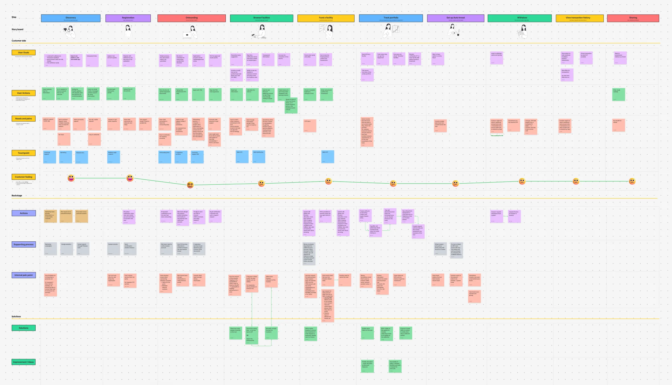
Review existing product
Within a team consisting of the Product Manager and myself, we reviewed the existing app by putting our review note and user feedback on the screenshots taken from the mobile app.
User research - Test ideas and solution
We did few brain storming sessions and quickly came up with some concepts and ideas. To verify our new design solutions, and deeply understand our customer pain points and needs, we conducted a User Study with 12 Investors who most actively used the platform and the app, accepted our invitation to join the User Study.
We combined a few methods for this research including Usability Testing and Qualitative Interview. The goal is to verify our draft design solutions and uncover any new problems.
After that, we listed down all the issues, put them into groups, and also created a customer journey map to and see where and what features we could add to improve the overall experience of the app.
📌 Key insights from the Study
A. Lack of visual: Customer found it easier to navigate around the app with new design, compared to the existing one, however, the new interface has not yet engaged them.
B. Missing information, features & instruction: Although we already incorporated some new features into the wireframe prototype, during the User Research, Investor still ask for few more features that was important to them:
- Ability to see more details about on newly listed facilities and the borrower before they decide to make a fund.
- Ability to check the portfolio performance.
- Can search and manage funded facilities easier.
- A clear repayment schedule so they can see when and how much money they will receive.
Design System
Why need a Design System?
- The old design looks outdated or no longer reflects Validus's brand. Therefore, we decided to create an new design that give a fresh look to the app and help improve user engagement.
- To set a standard design, maintain the consistency and manage it at scale for 3 products for total 3 markets.
The focuses:
- UI componens: Build scalable components and create the guideline how to use them.
- Icons, illustration: Create a library for icons and illustration that can be updated and extended easily.
- Copy writting: there was feedback from the User Research that the copy was not intuitive for users to understand. Hence we went through the copywriting of each label, make sure it's meaningful and help Investor clearly understand what is it about. We also add tooltip or description alongside special labels to avoid the confusion.
Key additional features
- More details on the newly listed facilities
- Improving the fund process.
- Portfolio tracking and repayment schedule
- Find funded facilities easier with search and filter
- New Overview page provide insight on the Portfolio performance
Design details
Navigation
Problems:
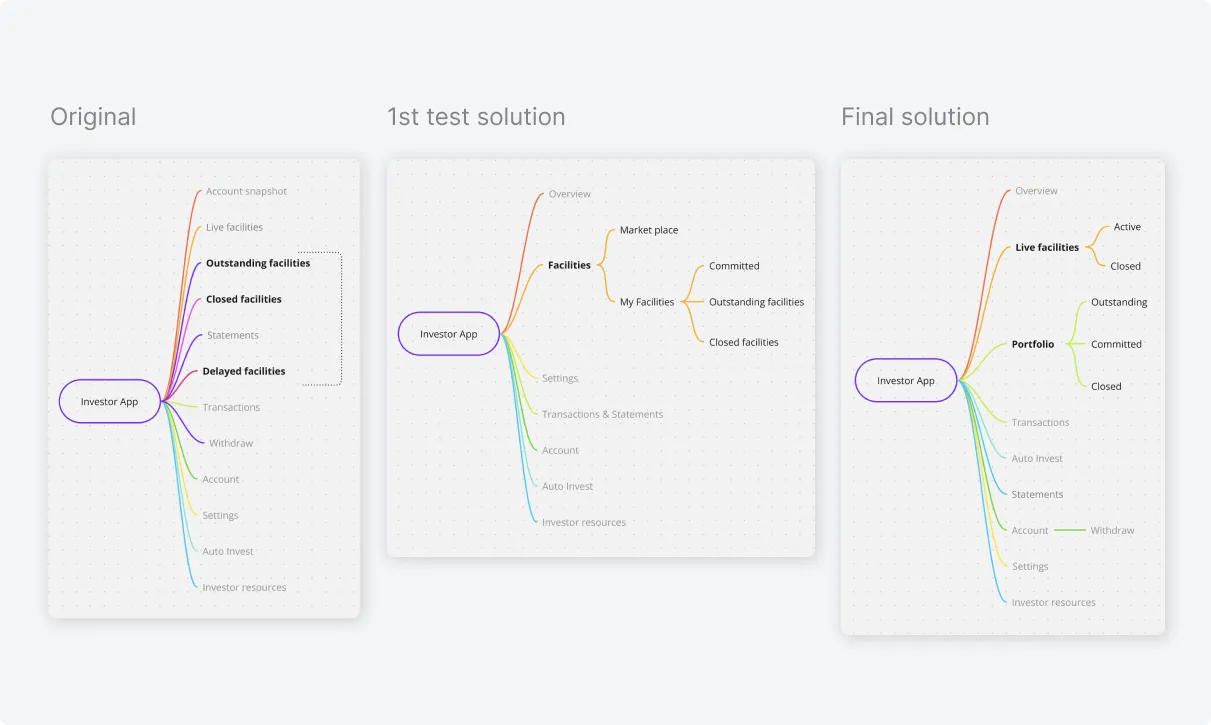
The old menu grouped all facilities by status and placed them right in the main menu which wasn't well-structured.
Design solution:
To help Investors access and mange all their portfolio faster, we moved all facilities into 1 place and keep them group by status as the same before.
Overview of the account
Problems:
Account summary was presented as Snapshot, in table style with the use of icons conveyed misleading and incorrect messages.
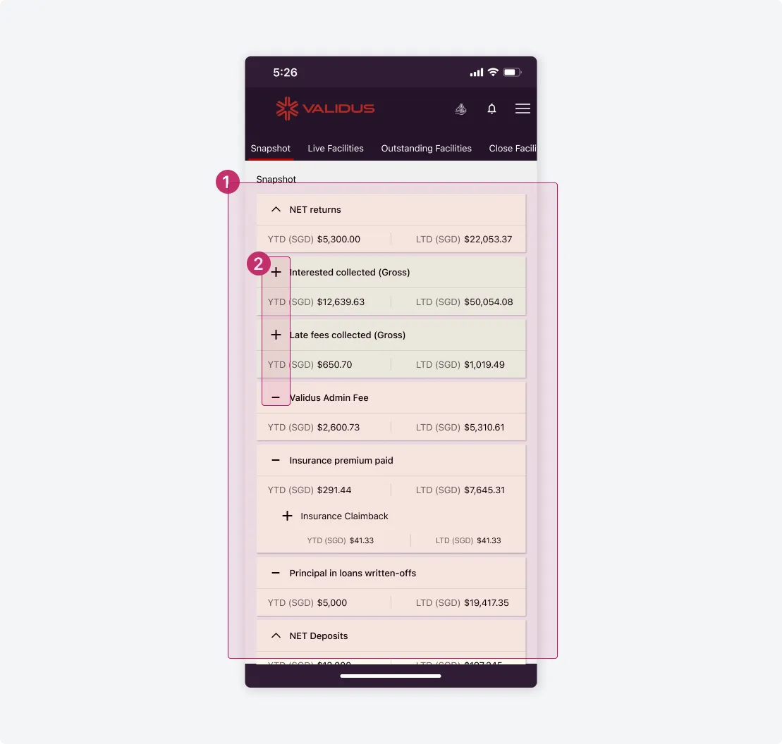
1. General issues
Common issues can be seen as: visual hierarchy, color coding, alignment, interactivity... The Snapshot screen makes it challenging for investors to easily understand and capture their account summary.
2. Misleading icons
The icons used are typically universally recognized as collapse and expand symbols. However, in this context, the "plus" and "minus" icons were intended to represent money inflows and outflows for Investors.
Design solution:
- Re-organize the information structure to enhance visual hierarchy and incorporating data visualization for better clarity and engagement.
- Add tooltip to explain some terms that may not be immediately understood by all Investors.
- Include a chart to visualize the portfolio allocation, and show more other data which requested by Investor to enable them see their portfolio diversification.
Facilities browsing
Live Facilities is the place where Investors can view all listed facilities available for funding. The details on the facilities help them gain more information of the loan in order to reach an investment decision.
Problems:
A facility only showed basic information which doesn't really help the Investors in determining the profile of the borrower.
1. Lack of facilities information.
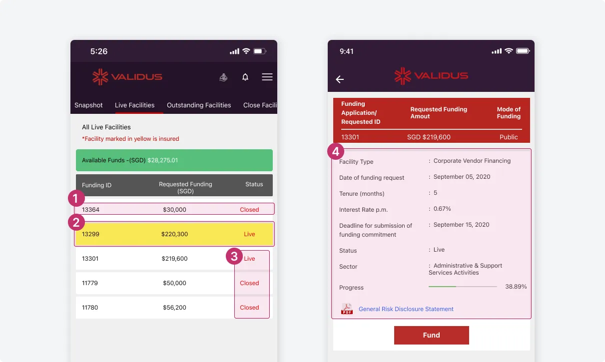
Display only the loan ID, requested fund, and status, with no indication that users can tap for more details.
2. Insured facility
Insured facilities were marked in yellow which did not effectively convey a sense of security and assurance.
3. Facilities status
Are shown in red, making it difficult to distinguish between the different statuses.
4. Facilities details
Did not include enough information about the borrower
Design solution:
More information about the facility added in the front. Card design helps to display and organize details better.
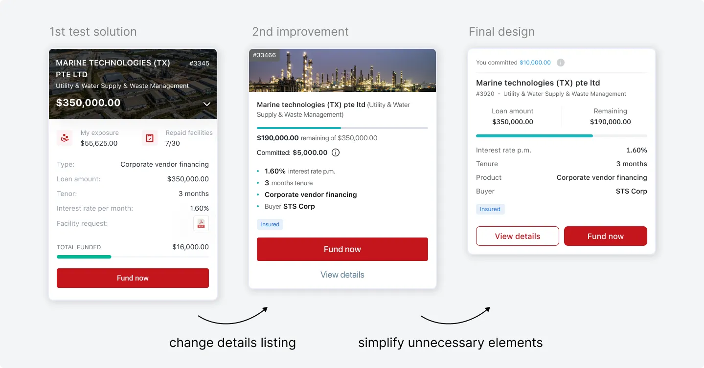
Investor can tap on "View details" to see more information about the loan, the borrower and their funding history with this borrower on the subsequence screen.
More data, better investment decision
Additional information requested by the investor during the interview was incorporated into the design both on the front and in the detail screen, helping the investor gain a better understanding of the facilities.
Intuitive interface
Investors now can see the requested loan amount, funding progress, and other related information in the front. New design was easier for them to understand and navigate around.
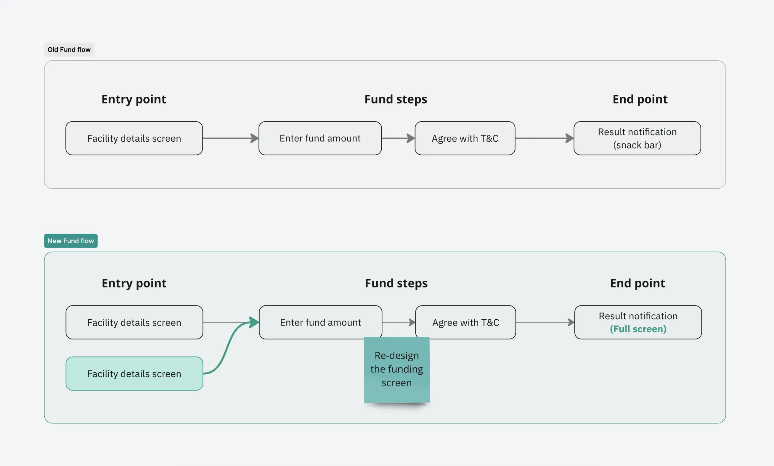
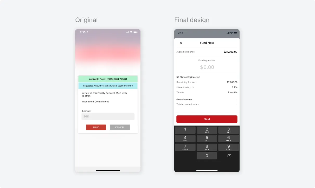
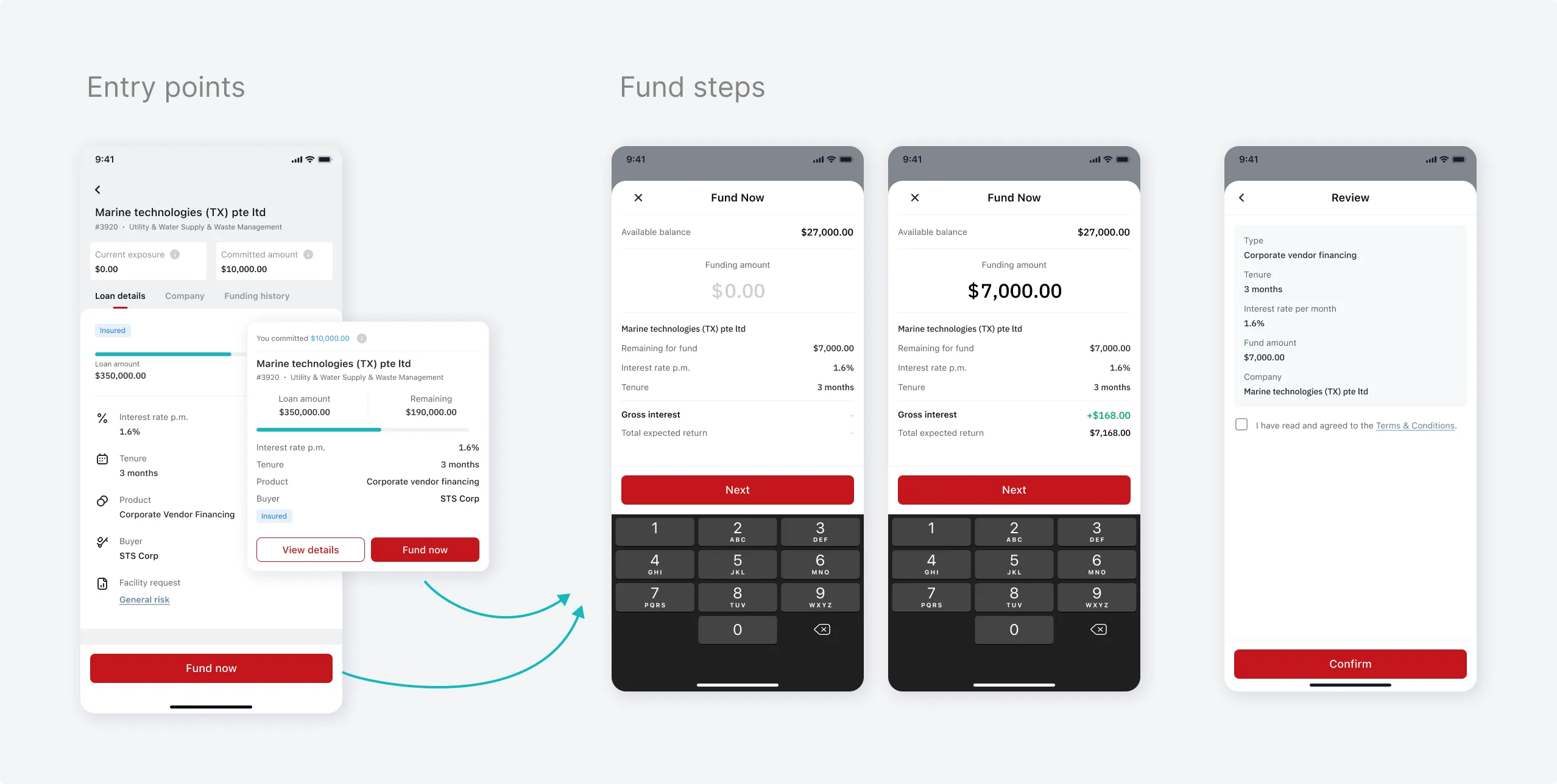
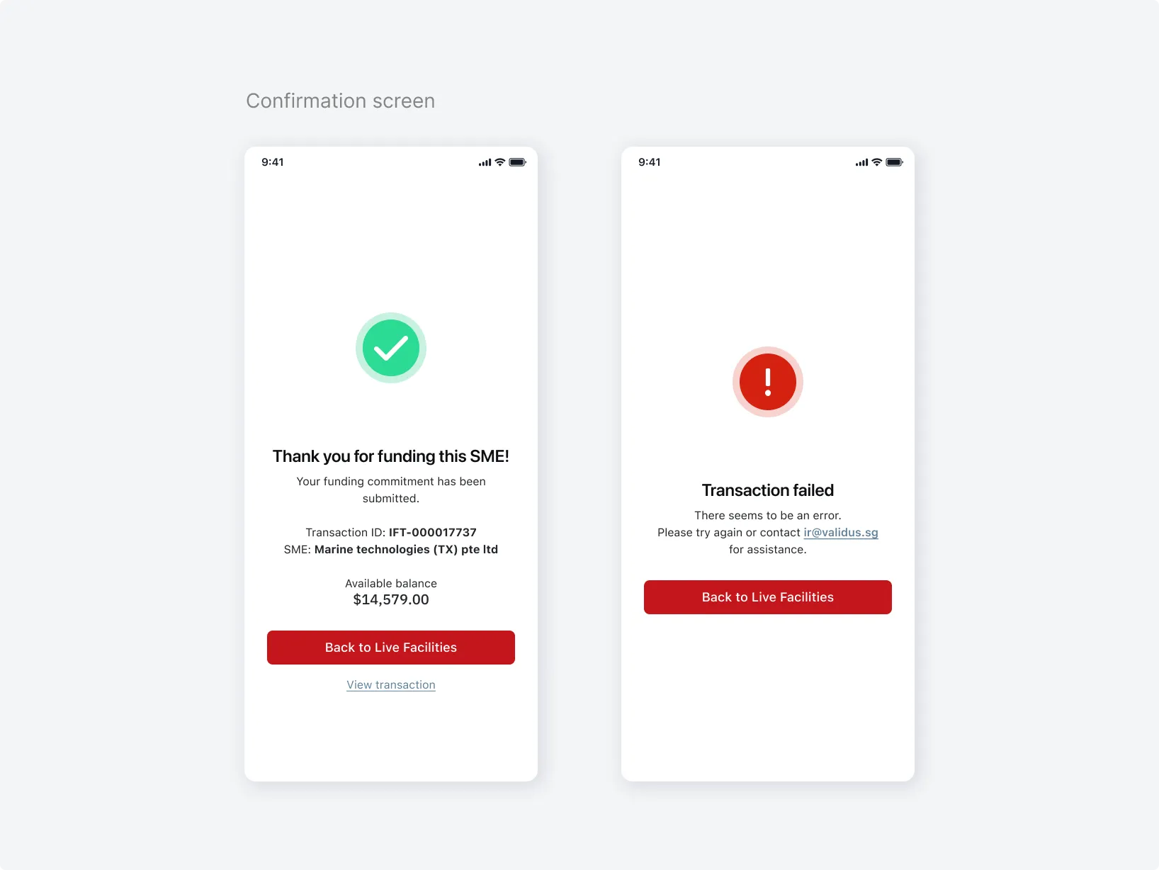
Fund process
Problems:
In the current flow, investors can fund a facility only by tapping the 'Fund' button on the facility details. After making a funding transaction, a notification (both success and failure) appears as a snackbar, which does not deliver an optimal user experience.
Design solution:
- Add another entry point to encourage Investor making the fund
- Replace the snack bar notification by a full-screen confirmation screen to display detailed information.
Portfolio Management
Problems:
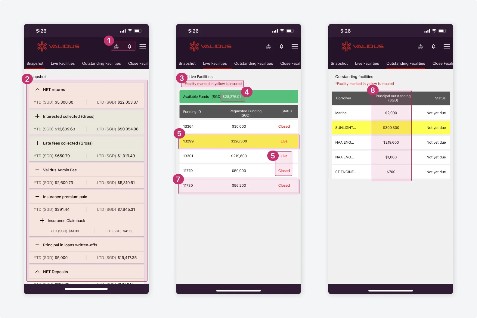
Given the nature of the facilities being very short term (typically 1-3 months maximum) and if the Users were very diversified in their investments, they would have multiple facilities, perhaps in the hundreds.
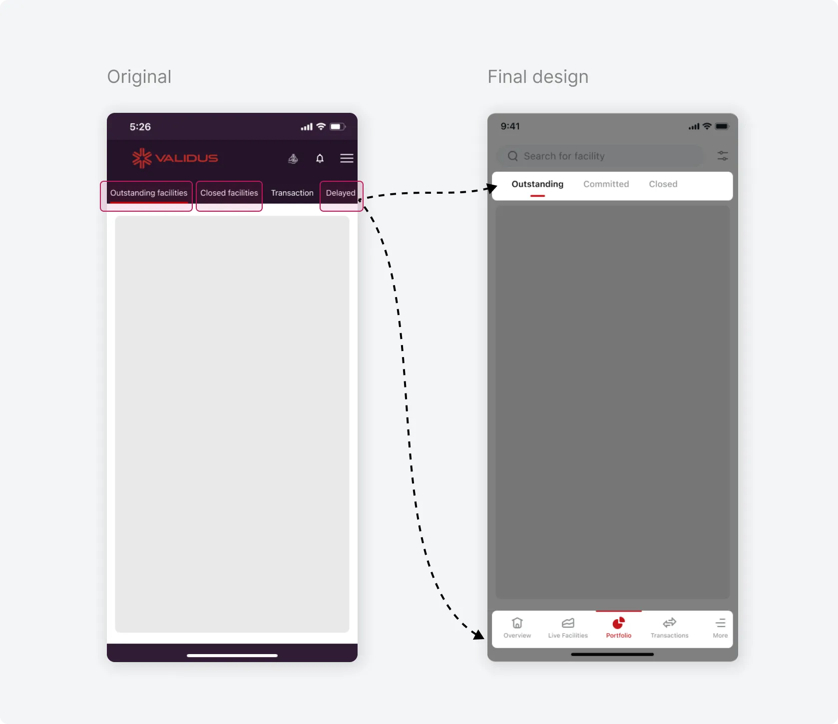
Currently, users can only find a specific facility by scrolling through 3 lists (Outstanding, Delayed, Closed) and searching for the facility ID or fund amount. This process is time-consuming and leads to investor dissatisfaction.
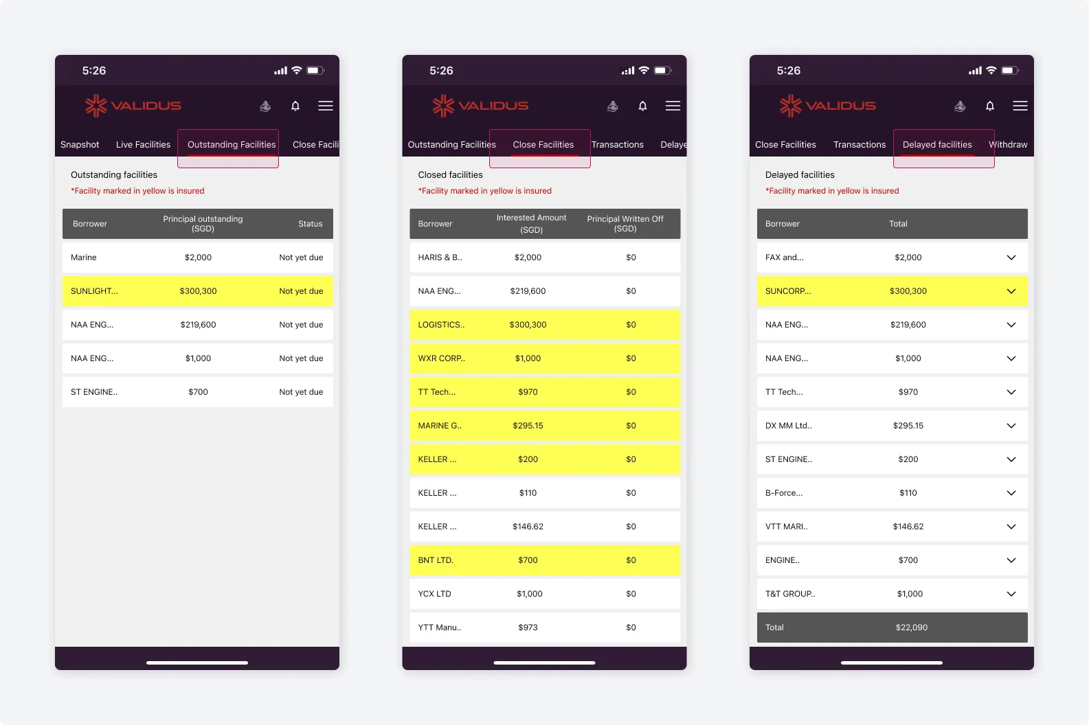
To find a facility Investor need to look into those 3 tabs
Another pain point is that most feedback from Investor was that they have no idea what's coming to due on their portfolio, when and how much they can can expect to receive. This lead to frustration and decreased the trust from them.
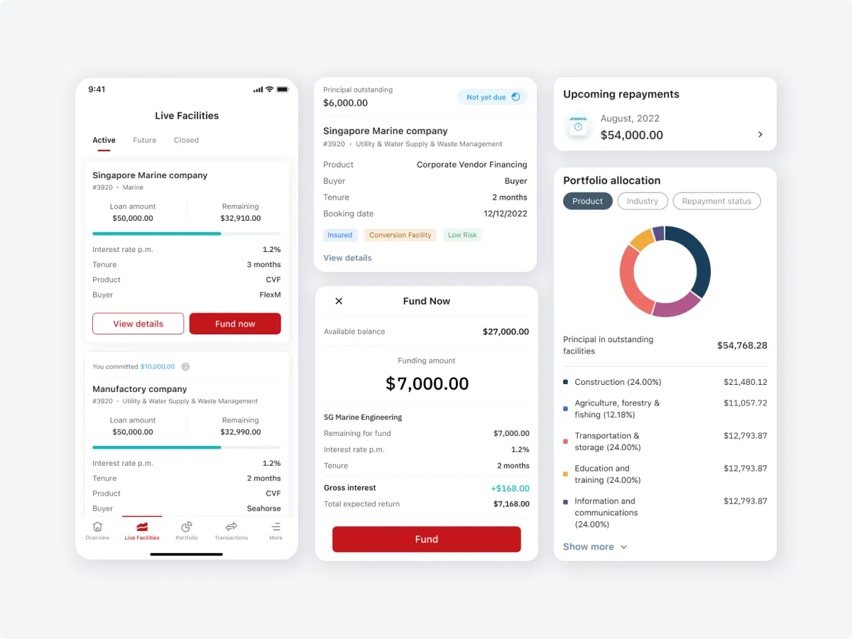
Design solution 1: Portfolio Summary
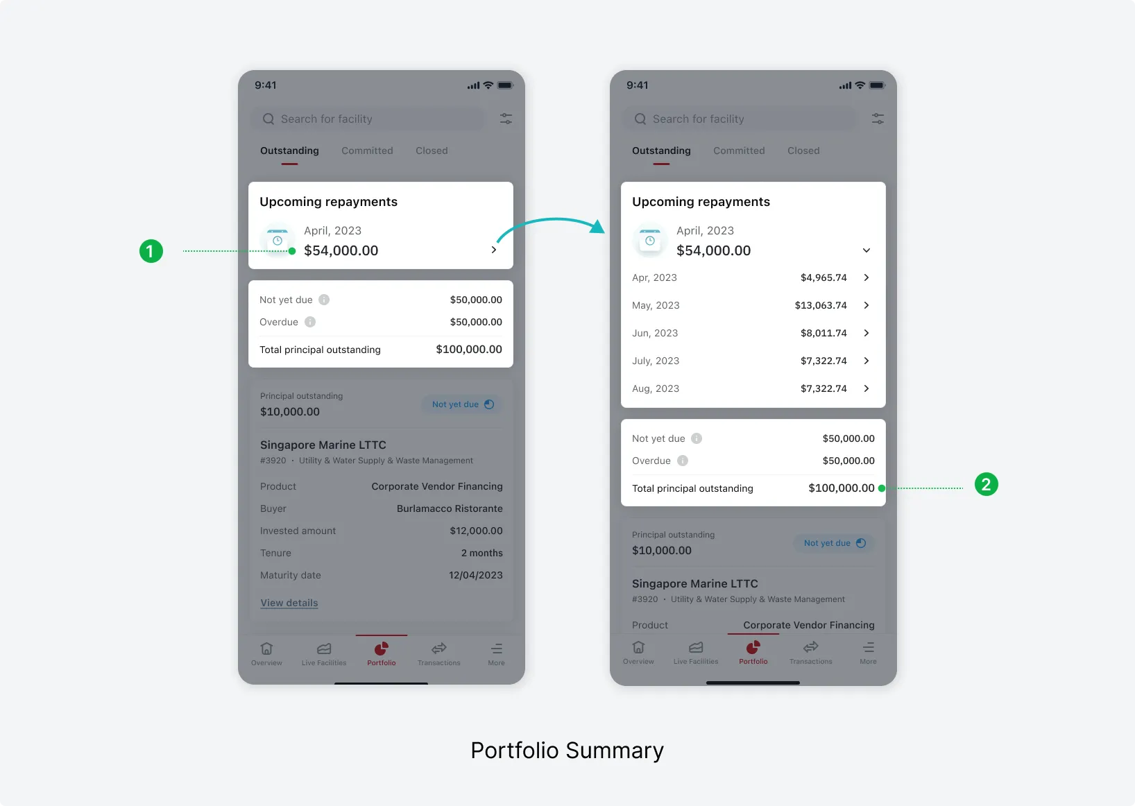
Upcoming repayment
Provide investors with a quick and clear update on their expected returns, including the amount and due date. When they expand the can see up to 5 months upcoming repayment.
Principal outstanding
Display a clear breakdown of amounts that are not yet due and those that are overdue, give investors a better understanding of their portfolio's status.
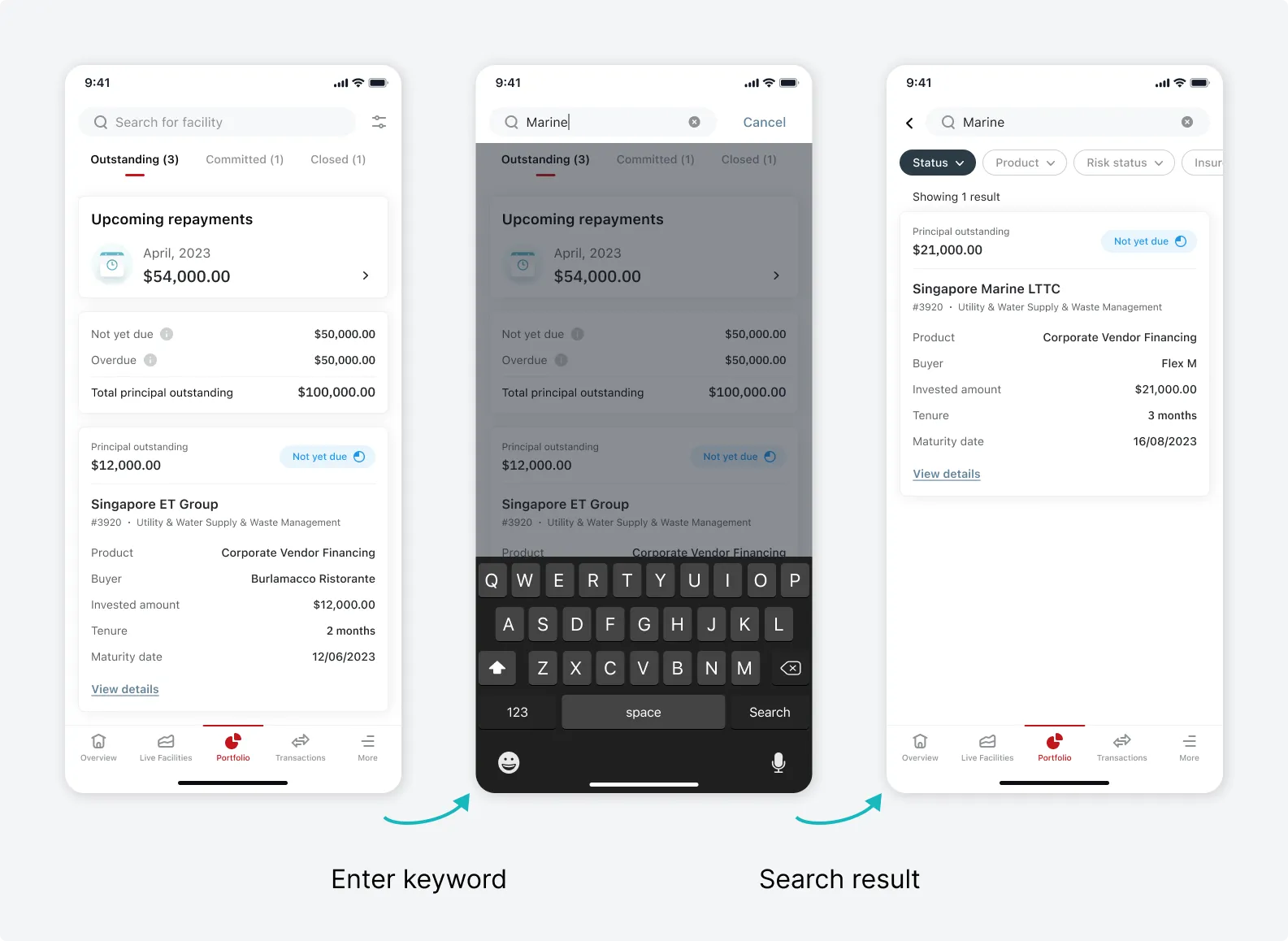
Design solution 2: Search and Filter
The search function and filters allow investors to quickly and easily zoom in on specific facilities to check for updates.
Investors can search for facilities by entering any keyword or facility ID. They can use filters to narrow down results or combine both functions for a faster and more efficient search.
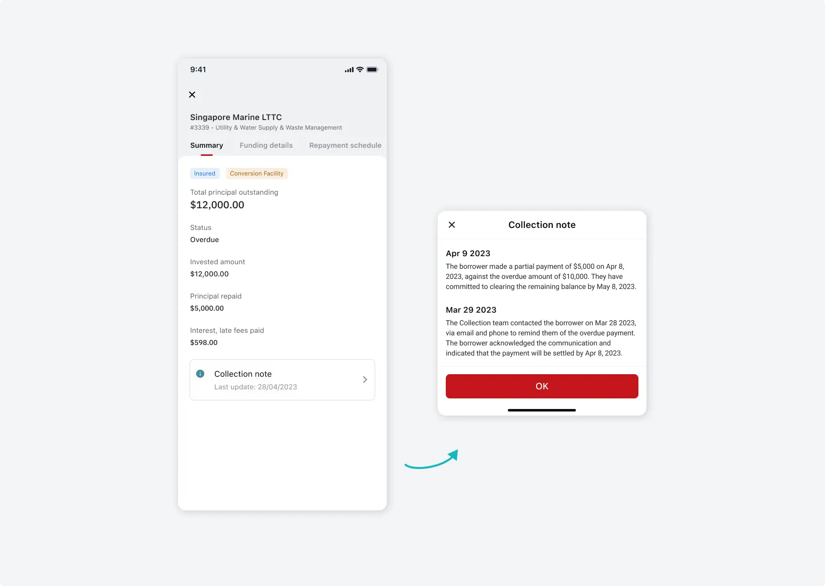
Design solution 3: Repayment Schedule
One of the top User needs that we collected during the User Research was the ability to view a detailed repayment schedule after funding a facility. This would have provided them with the expected due date and amount due for each facility.
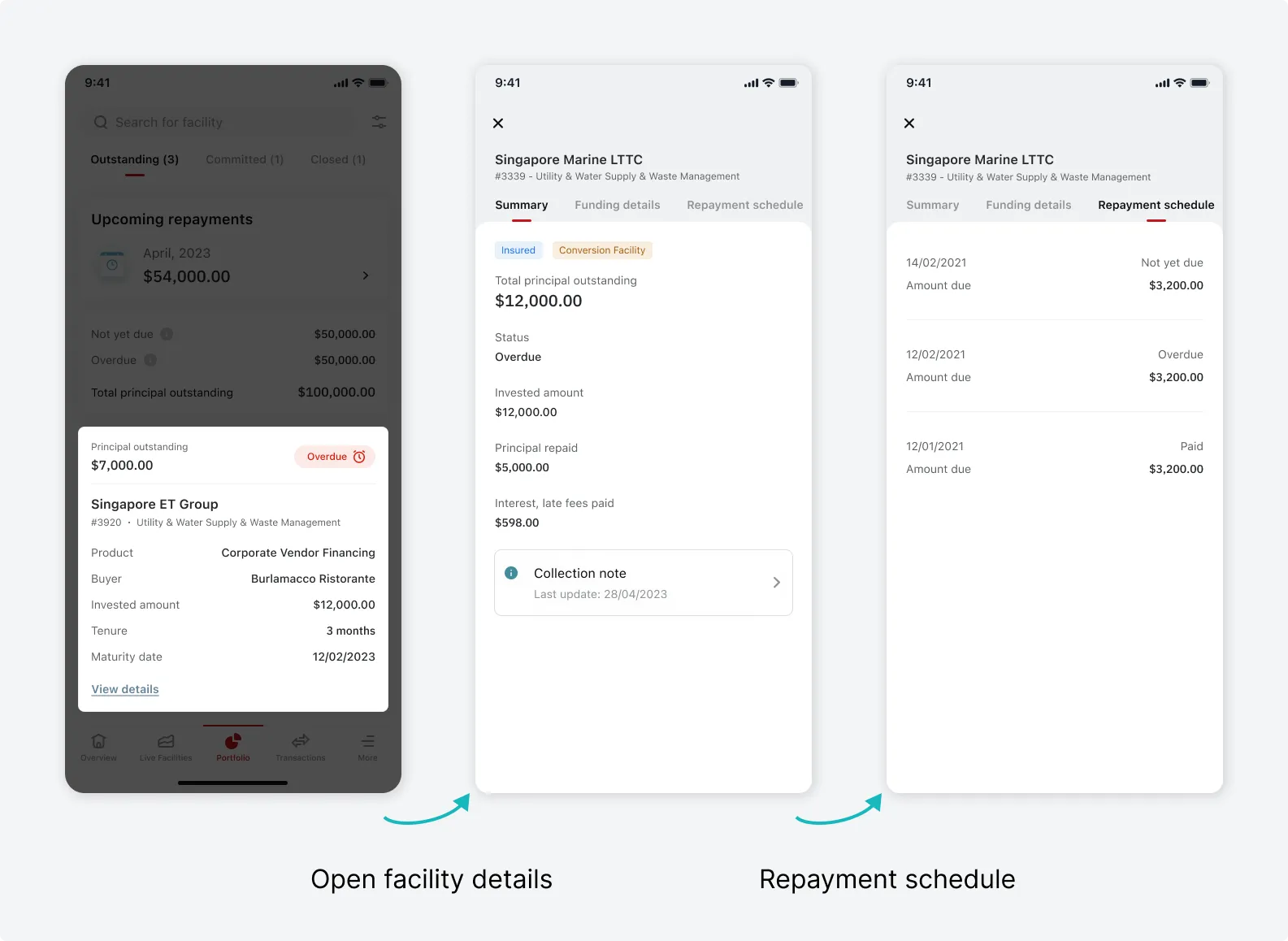
For Overdue facilities, we added Collection notes section, to keep investors informed with updates from the Collection team regarding collection details