 Projects
 App Onboarding
Simplifying the long onboarding proces
Account creation was missing in our Investor mobile app. There was no functionality for new users to sign up and complete the onboarding within the app, which lead to losing potential customer.
We have initiated a project aimed at simplifying the onboarding process from the current web-based approach to a mobile-friendly experience.
I worked with 2 other Designers to create the user flow, wireframe, and final designs. Additionally, collaborate with cross functional teams, I worked on assigning resources and keep track of the development.
Role
Lead Designer
Market
Singapore
Objective
The main goal is to create a account creation process for investors by using the app, making it more convenient and user-friendly.
On the other hand, we also want to streamline the collection of all necessary information and documents, reduce the need for paper-based documentation and make the process faster and more efficient for internal teams
Define
Gather requirements
Adapt from existing web platform
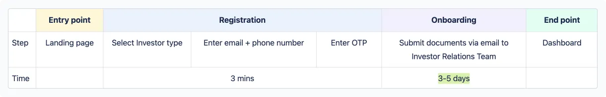
With fundamental steps, the current process can take up to 3-4 working days from account creation to the time all submitted documents are approved.
As a first steps, we created a wireframe flow for the mobile app based on the flow of the web, and shared it with the business team for review.
After received the feedback, realized that we didn't really understand fully the onboarding process for a new Investor as well as how the current system collects and stores information. Therefore, the wireframe we created didn't capture everything and the manual process mostly remaining the same.
Discuss with diffferent BUs
To address the knowledge gaps, we conducted a series of meetings with various BUs and these were important points that we learned from these meetings:
- Individual and Corporate Investor have different onboarding flows as Corporate Investor need to provide a lot more information. (Company info and it's legal representative)
- 80% of the investor on our platform is Individual Investor, which later we decided to focus on only this type of Investor
- Web-version didn't capture fully the actual onboarding process, there were a lot of offline support from Investor Relation Team in order for investors to actually get a verified account (paper submission and approval).
Mind map to capture the flow for the onboarding requirements
Connect the dots
What's required to have a verified account?
Once we collected enough information, we created a high level user flow to have a better understanding of what user had to provide to have a verified account, in compliance with Singapore's regulatory standards.
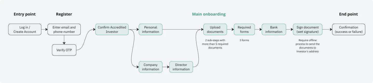
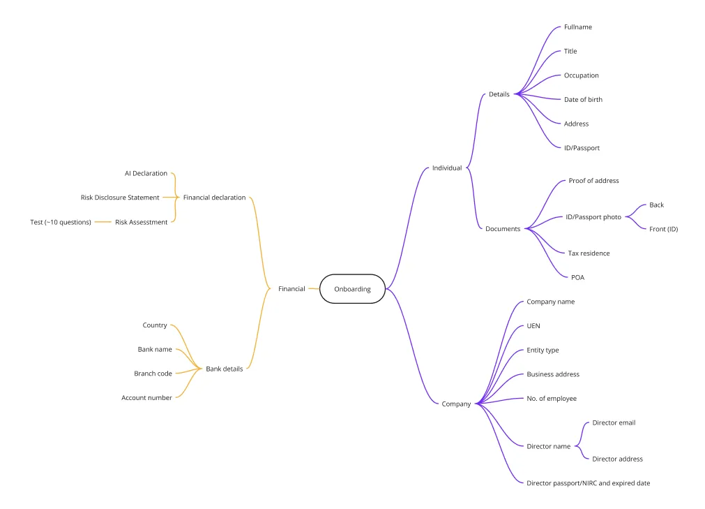
We had few brainstorming sessions and decided to divided the collecting information process into 4 main steps:
- Step 1: Personal information
- Step 2: KYC documents -- to verify identity and user address.
- Step 3: Required forms -- These forms are required by the Monetary Authority of Singapore and the Securities and Futures Act in order to participate as an investor on Validus.
- Step 4: Bank details -- to transfer the funds and get the repayment.
· · ·
Depended on the type of investor, users required to provide different sets of their personal or company details along with necessary documents. For Corporated Investor, the information and documentation requirements were more extensive may vary base on cases.
Therefore, we decided to focus on build the app onboarding for Individual Investor only, while corporate investors will continue to be onboarded through an offline process.
Problems
From our previous User Research, we were able to create a key persona, Shane.

Shane
Age
42
Occupation
Director in hospitality business
Nationality
Singaporean
Location
Singapore
Tech Savviness
Low to Moderate
Background
Shane works in a hospitality business for 15 years and very busy with his schedule everyday. While he uses his smartphone regularly for basic tasks like messaging, calls, and emails, he's not comfortable navigating complex and unsecure apps that ask him too much sensitive information.
Based on the high level flow, we created a detailed flow that include scenarios, main tasks and Shane's interactions to complete the onboarding.
In the first scenario, Shane is a new user and want to become an Investor on the platform using the app as his busy schedule doesn't allow much time for using a laptop or PC. With the detailed flow, we saw that Shane had to go through a lot of steps and provide a significant amount of information. He could face some problems and drop-off midway or need assistance to complete the onboarding. What we might do here is to find a way for Shane to quickly finish the onboarding and if he get any issue with any steps, he can reach out for help immediately.
The second scenario, is when Shane returns to the app to continue his onboarding process. This time he might not remember where he had left off last time and could not remember what he had done before. Therefore, we might have something to remind him or to show him what are the remaing steps/actions he need to do.
· · ·
Due to the extensive amount of information required, we anticipate that Shane may encounter the following issues:
Inability to provide required documents
In order to do the KYC, Investor needs to take and upload photo of some documents, such as: front and back of the ID or passport, billing or bank statement to verify their address, certificate of tax residence…
Some investors may not have the necessary documents readily available, which could result in them being unable to complete the process in one go.
Furthermore, they are required to fill out certain paper-based forms, which need to be returned to the Validus, causing some delays.
Lack of clarity on the purpose of providing information
Investors may not fully understand why certain information is required during onboarding process. There was some steps that required them to provide a numerous of personal information, income and assets.
Difficulty go through multiple steps
The onboarding process may appear lengthy and complex to investors with many steps.
Each step includes various information and sub-steps, which may lead to confusion, particularly on mobile devices where it's not possible to display everything on one screen.
Need support
When we talked to the Investor Relation team, the team that manages the communication with Investor, we received a feedback that Investor usually drop-off in the midway, and seek out for help via phone call and message. Sometimes those requests were missed. We will need to capture those support request from Investor during the onboarding.
· · ·
Therefore, the key challenge statement was:
"How might we simplify the onboarding process for investors, convenient, user-friendly and does not make Investors feel insecure?""
Key solutions
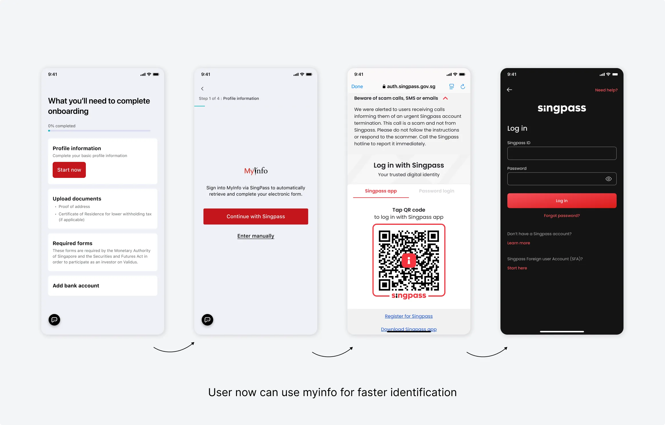
Provide information faster with myInfo
To simplify the steps of entering the personal information reduce number of required documents of the Investor, we decided to integrate myInfo to our platform.
This would be a second method for Investor that can speed up the KYC processes for individual users with data from Government sources.
It reduce more than 40%▾ the information and upload documents that Investor had to key manually in Step 1, compared with the web platform flow without myInfo.
As a result, it increases the chance that Investors can complete the process in one go.
Provide UX pattern to advoid confustion and create an engaging onboarding experience.
- Checklist to show the summary what need to be done
- Progress bar to inform user their onboarding progress
- Instruction on each steps
- Contact or get support feature
Design
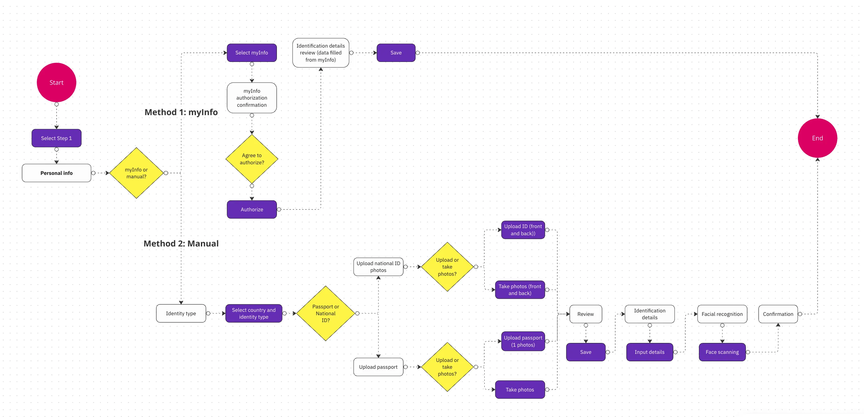
Wireframe
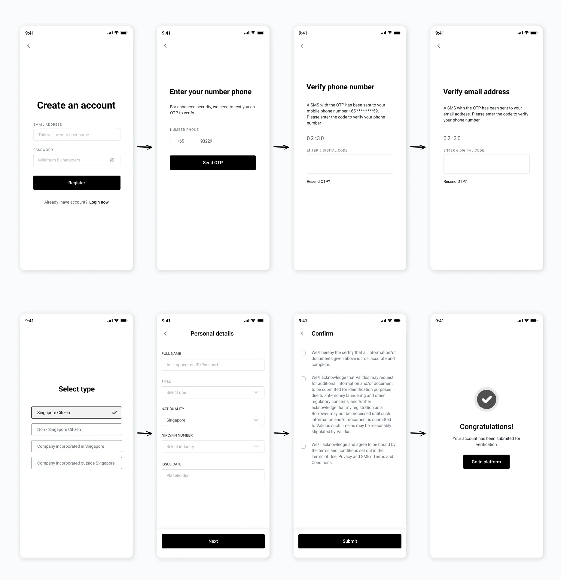
To create user flow and content layout, I sketched out wireframes for main screens that users would need in order to complete the onboarding. This part of the process required us doing quite a lot of iterations in order to get the flow and layout approved since its needed multiple teams to sign-off on the solutions.
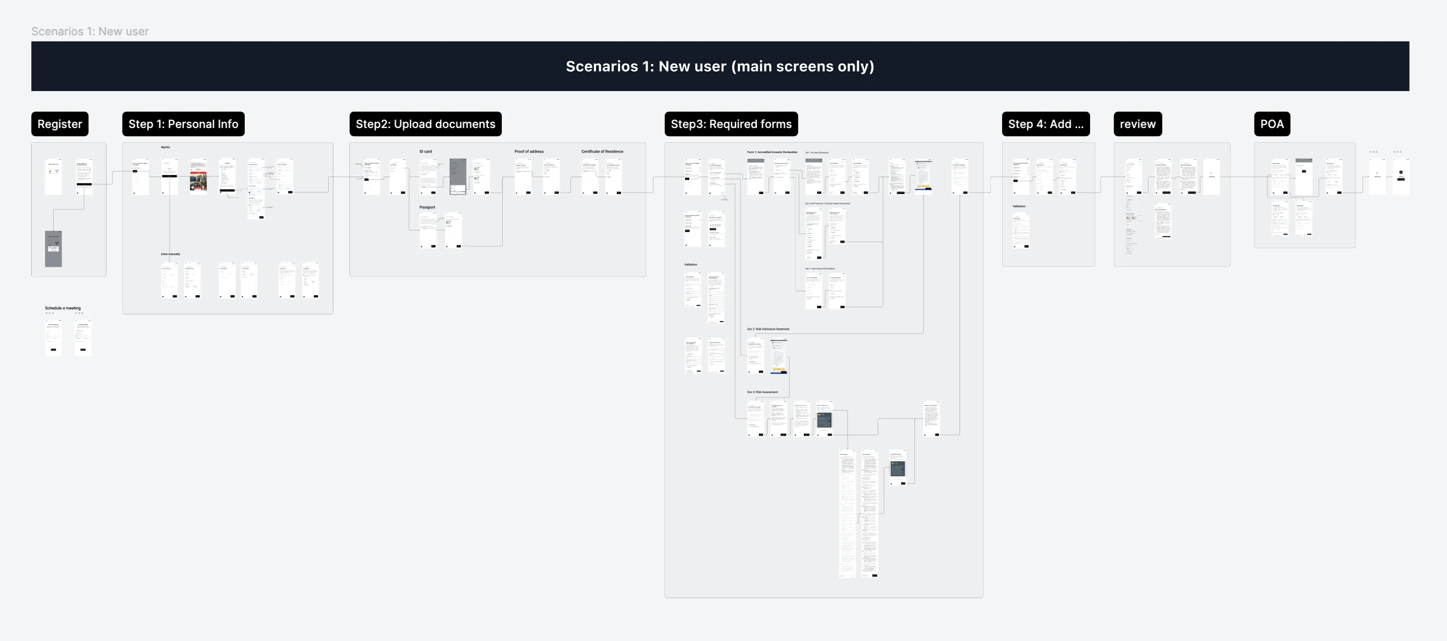
Final design
Final design 1: Integrate myInfo for fast and secure identification
With just few tap, User can now use their Singpass to provide their personal information.
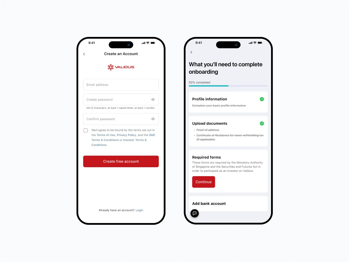
Final design 1: Checklist screen helps user get started easier
To ensure that investors don't get lost during the onboarding process, it's important to incorporate a checklist screen in all scenarios, whether it's new beginnings or ongoing progress. This screen serve as navigational screens, allowing investors to stay informed and engaged throughout their journey.
From the initial design, we went through several drafts with various UI modifications to craft the final design as below:
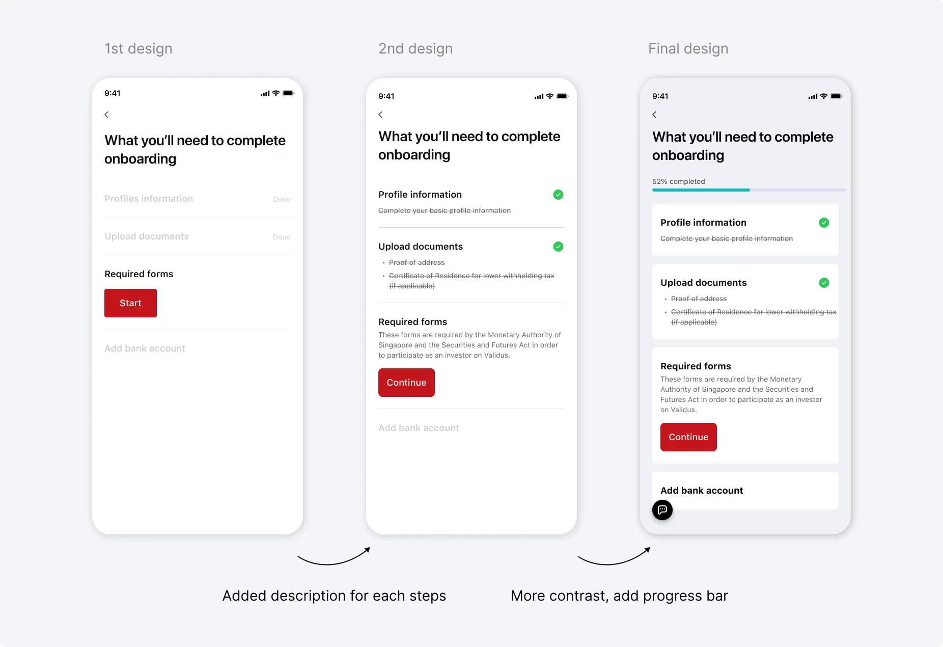
This checklist screen is also appeared when Investor login the app if they haven't finished their account verification before and still have pending items need to be completed.
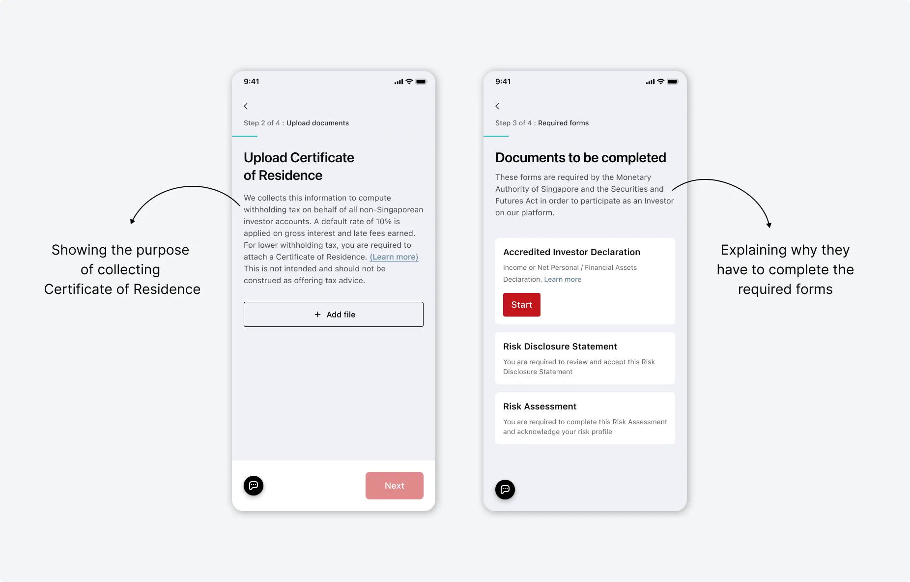
Final design 2: Provide instruction
During the onboarding process, we need to gather a significant amount of sensitive personal information from Investor. Having clear instruction at each step help Investor to understand the purpose of collecting those information.
This help to reduce frustration and mistrust.
Final design 3: Seamless context-switching with fullscreen modal
The critical parts lies in the steps involving the Required Documents. Investor must complete 3 financial declaration forms, each of which comprises 2 to 3 steps.
At first, we used simple default 'push-to-left' transition between all screens. But it became confused for Investor, as it created an "endless onboarding" feeling through out 4 lengthy steps.
To prevent this, we altered the transition to 'open a fullscreen modal' from the bottom, enabling the investor to stay informed about the context switch . Once Investor finished filling out a form, it ends the flow by closing that fullscreen modal. This micro transition imbues users with a sense of accomplishment.
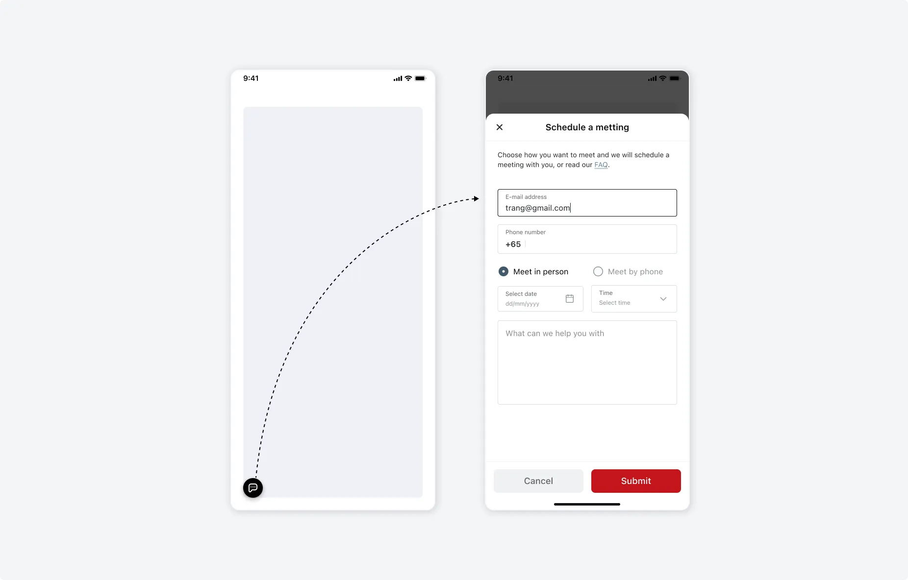
Final design 4: Support at anytime
Long processes can overwhelm users, leading to confusion or mistakes. Therefore, to ensure that users feel guided and reassured throughout, we added an option for them to get support at any step during the onboarding.
This enhanced user trust and satisfaction, which very important for processes involving personal or sensitive information.
During our the research, we noticed that our Investor often ask the Account Manager to support them in person. To address this preference, we added an option in the form for them to select if they prefer to talk to our staff via phone or arrange a face-to-face meeting.
Takeaway
Due to the nature of the company business, the onboarding for new users can be very long and complex. However, we still can create a user-friendly design with clear instructions to make experience smooth and intuitive for users.